Design Shanghai unveils new visual design!
)
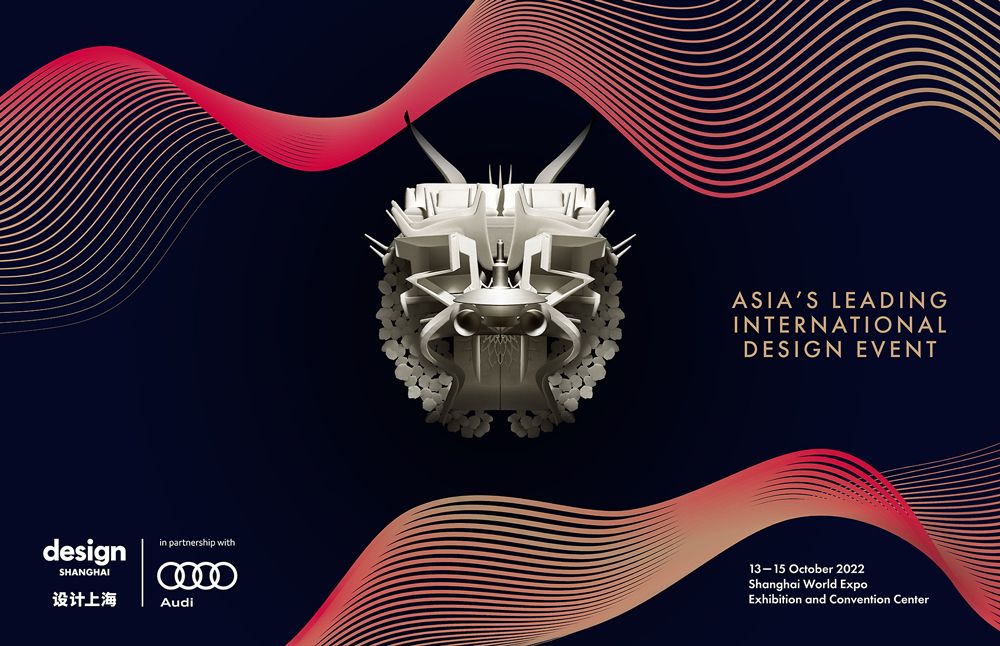
Design Shanghai's new visual theme represents the connections that designers and brands make with their audiences – the vibrations they send out and receive. The energy and sense of movement presented within the designs reflects the exciting and dynamic new product currently being produced, despite the impact of COVID, within this vibrant and responsive industry.
The dragon illustration remains a hero element of the brand, its use reserved for impact, with the line work running through the backgrounds in both a supporting and leading role.
The logo has been refreshed for 2022 to modernise the overall appearance, the red block has been removed to allow the logo to be better integrated within the design.
The show city names are all presented with the same relationship to the design logotype. Other minor adjustments were made to the design logotype to bring it closer to the original typeface and improve legibility.
Red remains our hero colour, but appears within a red to gold gradient within the vibration line work to create a more tonal variety and sensitivity. When combined with the black background, it creates a sophisticated and rich colour scheme.